Rebuilding a recognisable brand system for everyday use at scale
Rebuilding a recognisable brand system for everyday use at scale
Brand strategy
Digital brand experience
Corporate & multi-market brands
Strategic storytelling
Brand systems
Project snapshot
Client: Selecta
Rebuilding a recognisable brand system for everyday use at scale
Challenge: Bring coherence and meaning to a complex, multi-market brand ecosystem.
Strategic approach: System thinking across brand, sustainability and digital touchpoints.
Outcome: A clearer, more human brand that scales across countries and categories.
My role: Group brand strategy · Brand architecture · Brand narrative · Visual identity system (CI/CD) · Design governance · Digital & physical brand experience · Pan-European rollout
THE CHALLENGE
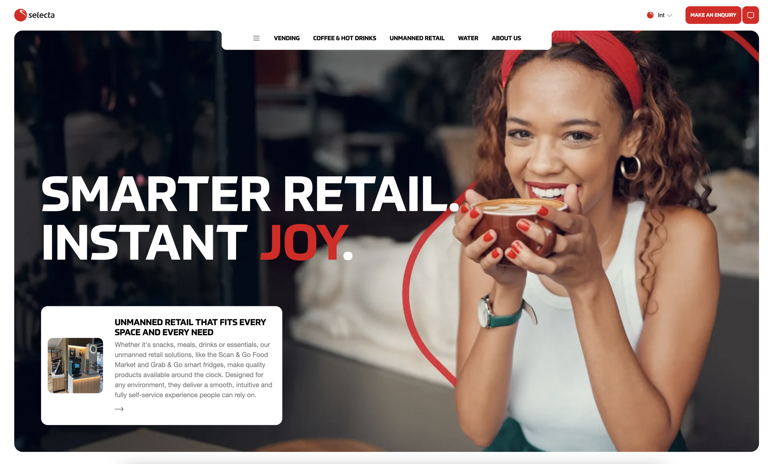
Selecta operates in everyday environments, offices, hospitals and transport hubs, across multiple European markets. These are spaces that demand clarity, calmness and immediate recognition.
Over time, however, the visual identity had grown increasingly complex. Decorative colour gradients, abstract ‘Joylines’ and layered compositions created expression, but lacked restraint. What looked rich in concept became difficult to apply in practice.
The system required interpretation rather than guidance. Rules were open to variation. Execution depended heavily on designers. And in busy, functional environments, the brand struggled to stand out through calm presence alone.
This complexity affected more than usability. Despite its scale and visibility, Selecta was not always instantly recognisable, especially at distance, on machines, or across digital touchpoints.
The challenge was not to make Selecta louder, but clearer.
To shift from decoration to design. From expression to structure.
Creating a contemporary identity built on space, consistency and confidence, one that feels present without shouting, and recognisable without explanation.
STRATEGIC INSIGHT
A brand system only becomes strong when clarity and recognition work together.
For Selecta, the solution was not adding new elements, but removing what stood in the way. The identity needed fewer components, clearer hierarchy and stronger anchors, so it could be recognised instantly and applied effortlessly.
In a brand that lives in everyday moments, decoration fades. Structure remains. Clarity at scale is not creative, it’s operational discipline.

“When colour becomes memory, design becomes brand.”

BRAND STRATEGY, SYSTEM & ARCHITECTURE
The renewed Selecta identity was designed as a functional, recognisable system, not a decorative layer. The focus shifted from expression to meaning: what defines Selecta visually, works at speed and scale, and can be applied consistently across markets without explanation.
By anchoring the brand in a small number of unmistakable cues, Selecta red as the primary identifier, supported by burgundy for depth and white for clarity, recognisability was strengthened and complexity reduced. Gradients and “Joylines” were removed to improve usability and consistency across physical and digital touchpoints.
The result is a clear, scalable brand system that functions as a tool: recognisable at a glance, flexible within defined boundaries, and easy to apply across machines, digital platforms and communication materials. The logo evolved into a structural anchor, enabling faster deployment and greater consistency across markets.
the EXECUTION
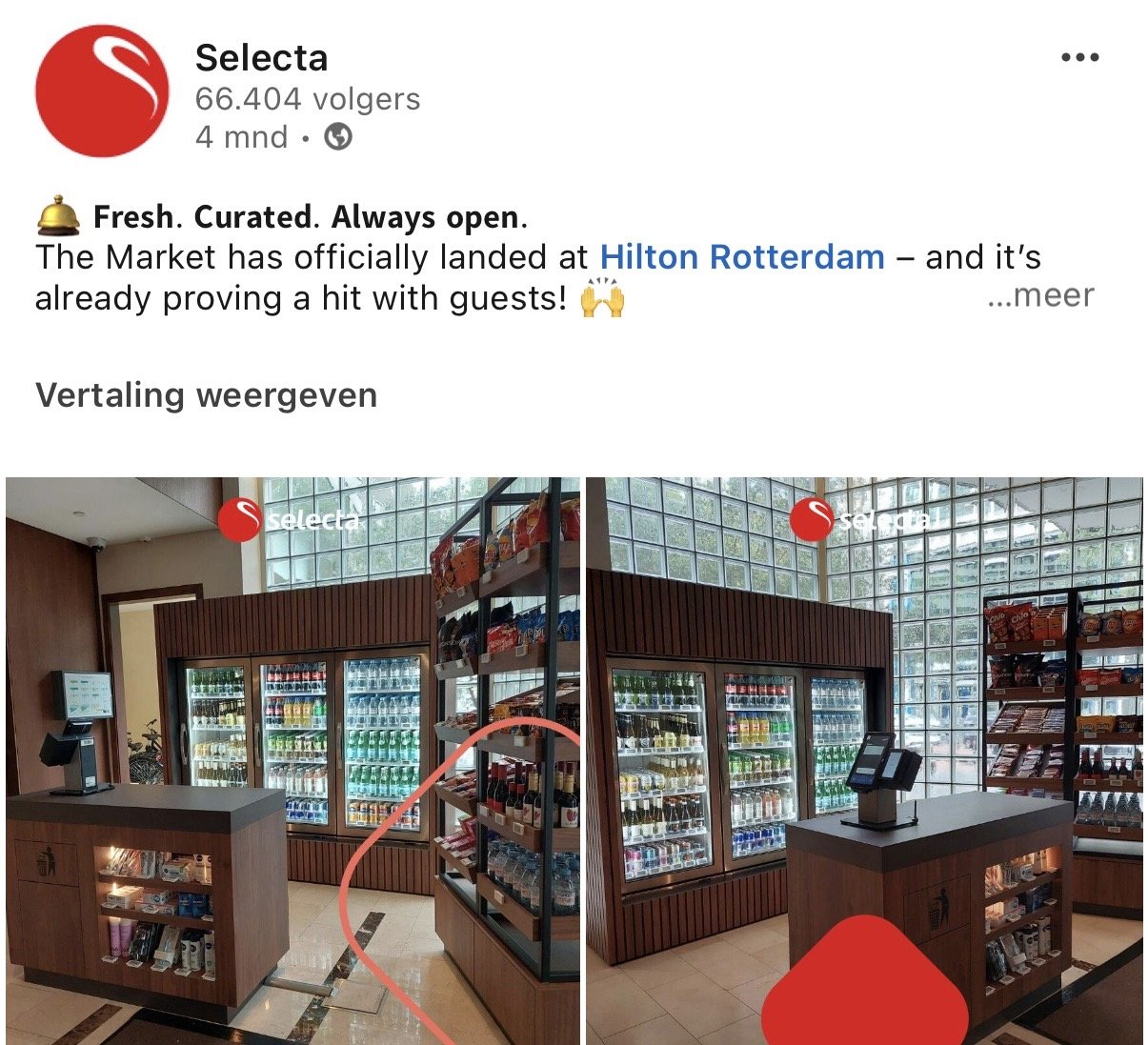
The new CI/CD system was rolled out across key Selecta touchpoints, including:
brand guidelines and governance tools
corporate and commercial presentations
digital templates and internal assets
physical applications in everyday environments
Crucially, the system was designed for real-world conditions, not ideal scenarios, enabling local teams to work confidently and independently.
the business IMPACT
The renewed brand system resulted in:
a unified brand narrative across 16 markets
stronger visual recognition across markets
strenghtened consistency in daily applications, without limiting local relevance
reduced reliance on bespoke design solutions
scalable story telling across products, platforms, and regions
a future-proof foundation for innovation and partnerships
What changed was not just how Selecta looks, but how the brand functions.
What this shows: this project demonstrates how recognisability is built through reduction, not addition. By simplifying the visual language and grounding it in a small number of meaningful choices, Selecta gained a brand system that works at scale, and is recognised instinctively, every day.